A veterinary brand that needed its look to match the care it gives
Dido Veterinaria looks after pets in Bogota. The care was already there. The brand around it was not pulling its weight yet, especially across the print and social channels where pet owners actually see it. We built one identity and produced the photography and content to carry it.
- Brand
A single visual identity built to stay consistent across print and social.
- Photography
Product photography of food and clinic items, shot for use across channels.
- Content
Online content and layouts produced for ongoing publishing.
The care was clear. The brand around it was not
Dido Veterinaria had a real practice and a clear way of treating animals and their owners. What it did not have was a brand that looked as considered as the work, especially once it moved into print and social.
Pet owners make a lot of their decisions on feel. A veterinary brand that looks scattered across channels makes that trust harder to earn before the first visit.
The job was to give the practice one identity it could reuse, and the photography and content to put that identity to work.
Build one identity, then produce for the channels that matter
We started with the brand: type, color, and layout rules that hold up whether a piece runs as a printed magazine page or a social post.
With the system in place, we shot product photography of food and clinic items so the brand had its own images to work with, instead of relying on stock.
From there we produced the online content and layouts, designed so the team can keep publishing in the same look after the engagement.
An identity plus the photography and content to run it
The work covered the brand identity, a set of product photography, and online content laid out for print and social use.
Each piece was built from the same system, so the magazine spreads, product shots, and promotional banners read as one brand rather than separate one-off designs.
The result is a brand the practice can keep using, with a starting library of images and layouts to publish from.
Selected pieces
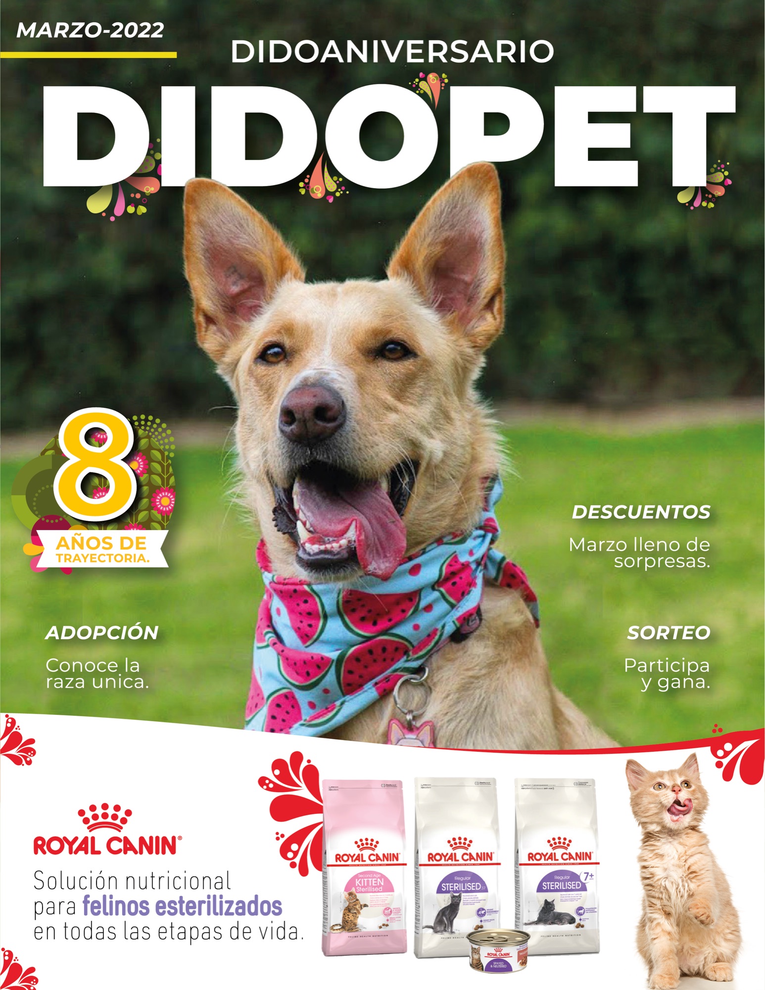
Magazine cover built on the new identity. 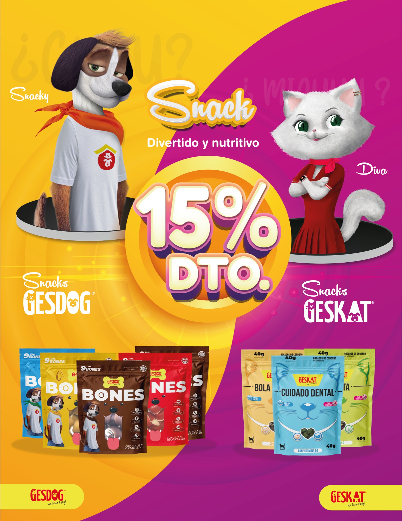
Editorial spread carrying the brand system. 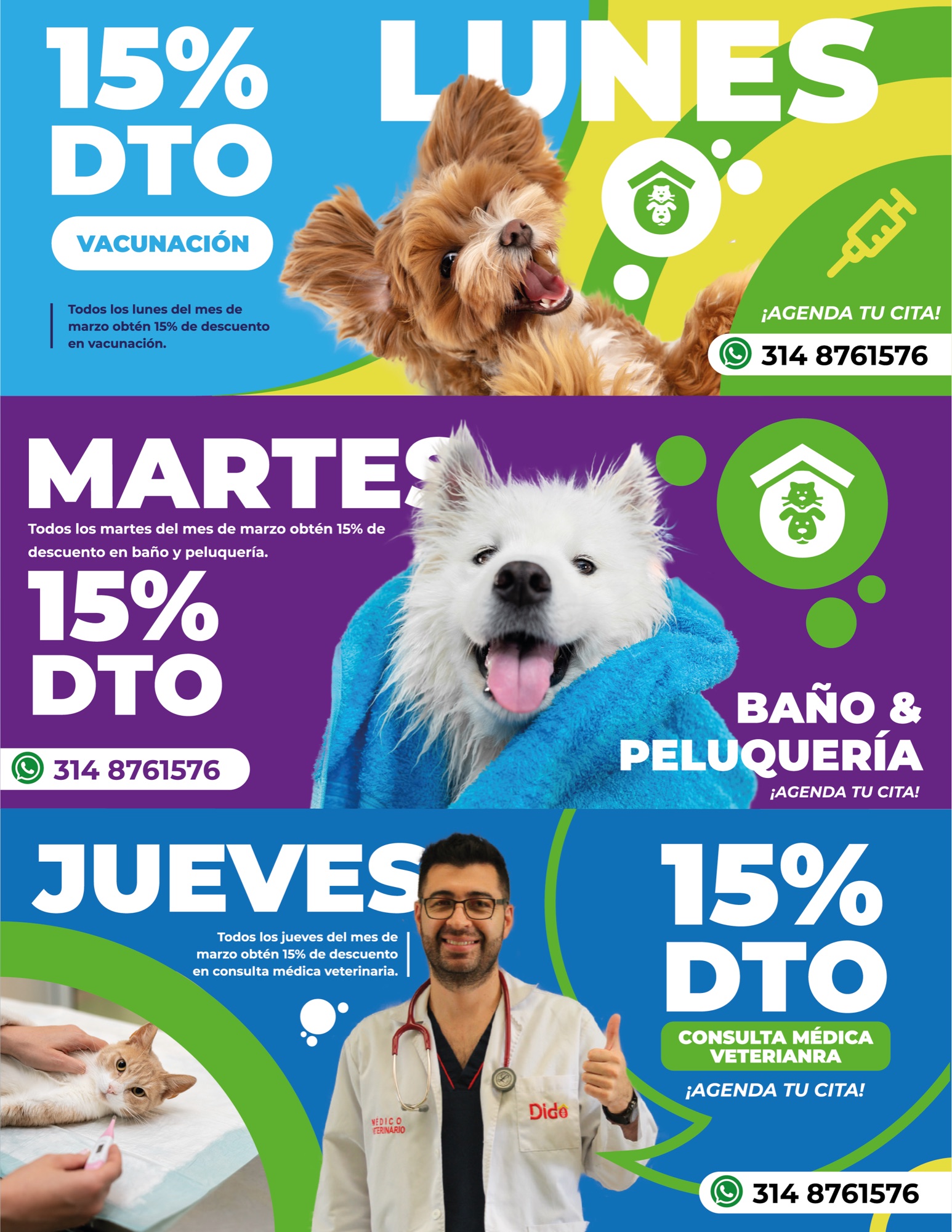
Product photography placed into the layout. 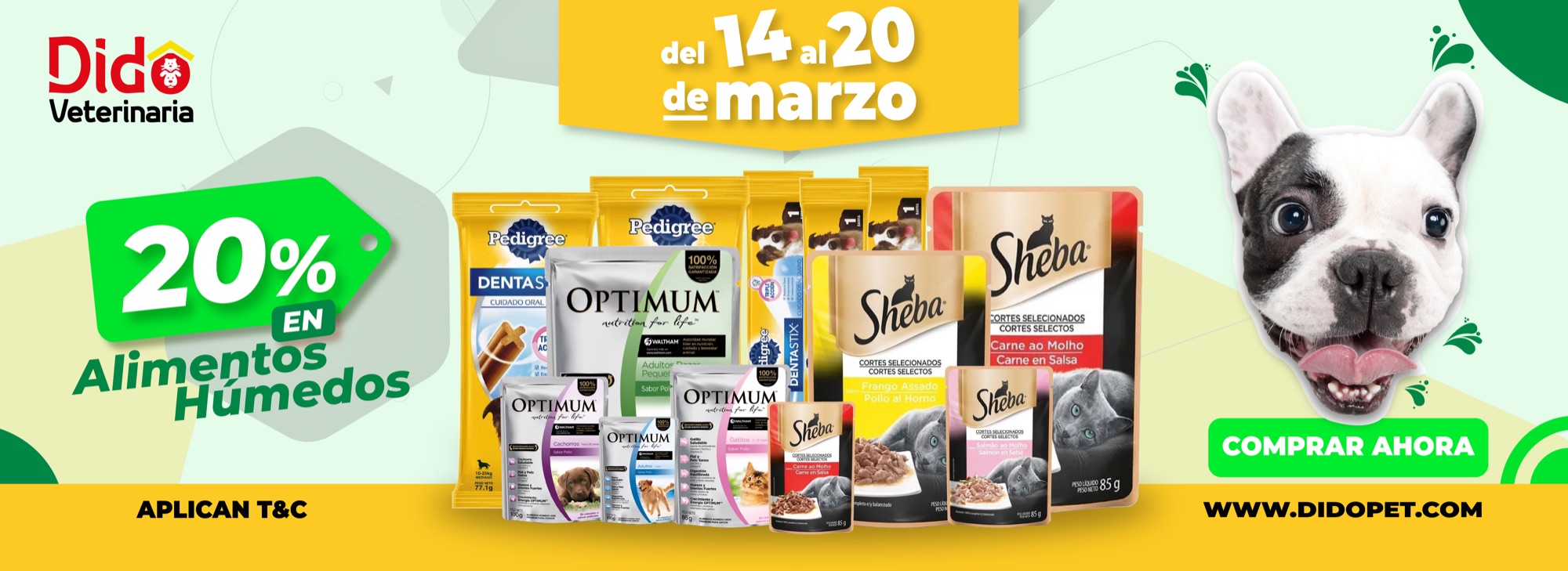
Wet food banner adapted for social and print.
What shipped
Brand identity
Type, color, and layout rules built to stay consistent across print and social.
Product photography
Photography of food and clinic products, shot for reuse across channels.
Online content
Content and layouts produced for ongoing publishing in the same look.
Print pieces
Magazine spreads built on the identity system.
Promotional banners
Campaign banners adapted for social and print from one set of rules.
Reusable system
A brand structure the team can keep publishing from after the engagement.
About this case
This is an early version of the case. Specific scope details and results will be added once they are confirmed with the client.