
A technical manufacturer had outgrown the website carrying its sales story
The company made precise components for serious technical buyers. The old site did not match that level of work. Product paths were hard to scan, the first screen looked dated, and the experience still assumed a desktop buyer.
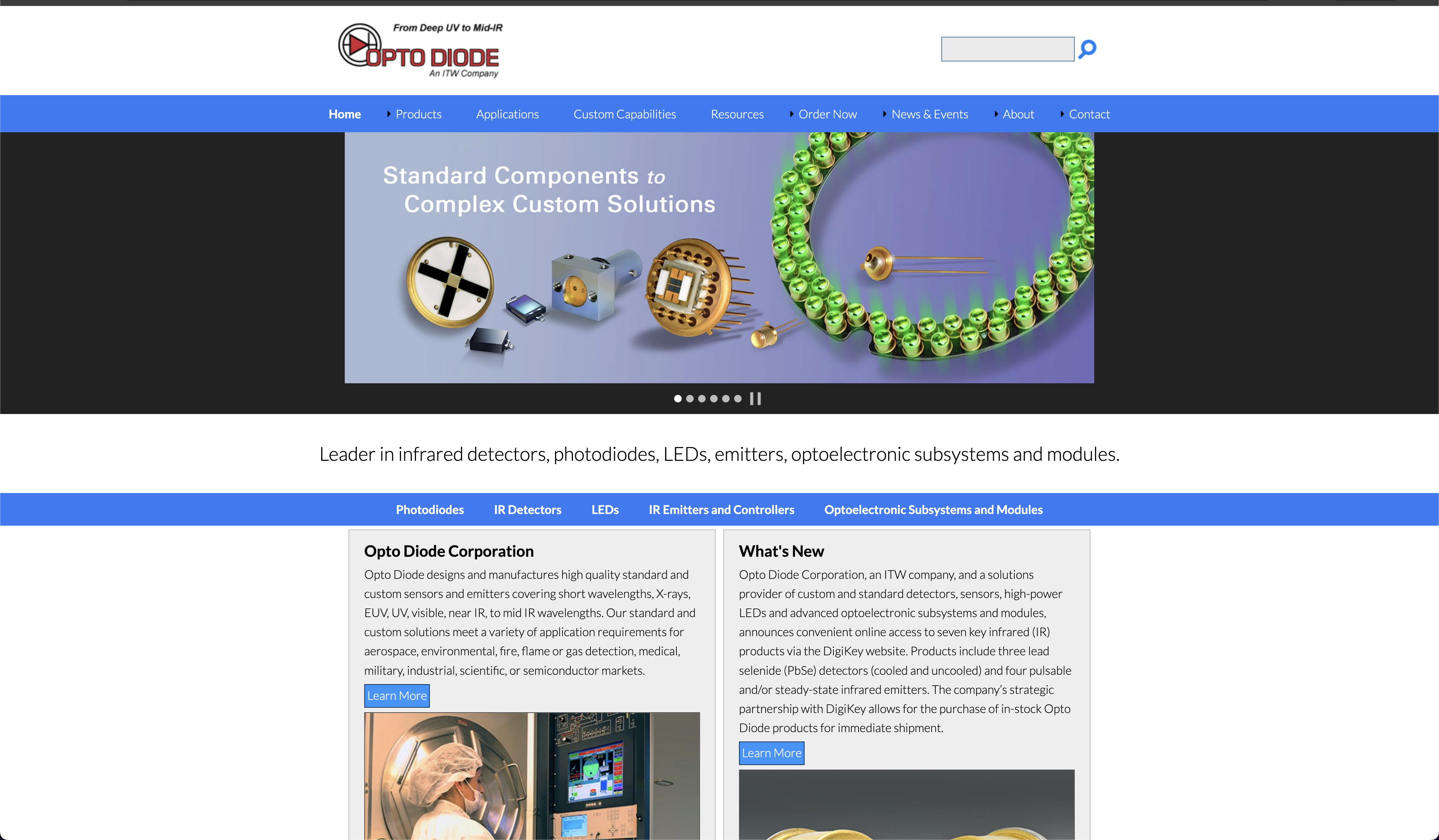
- Before
Dense navigation, dated homepage structure, and a desktop-first layout.
- After
Sharper first screen, clearer product paths, and responsive page structure.
- Scope
Information architecture, website direction, interface system, and quote path.
The site made a serious manufacturer feel harder to read
The old homepage had the right pieces: product families, applications, resources, ordering, and company information. They were all fighting for the same first-screen attention.
For a technical buyer, that creates friction. Engineers and procurement teams do not need decoration. They need to find the right product path, understand the category, and know where the quote conversation starts.
The bigger issue was trust. The company made specialized components for demanding environments, but the website looked like it had missed several product cycles.
Keep the technical credibility. Clean up the path
We did not try to make the site feel like a consumer brand. The work started with the product map: what buyers needed first, what belonged deeper in the site, and which paths should stay visible from the header.
The new homepage put the category message first, gave product exploration and quote intent their own actions, and reduced the number of competing decisions in the top navigation.
Visually, the goal was sharper contrast and a more technical mood without making the site feel cold. The interface needed to fit photonics, not generic software.
A responsive site system, not just a prettier homepage
The rebuild covered homepage direction, product navigation, resource paths, quote entry points, and a responsive layout that holds up on smaller screens.
We gave the site a clearer visual system: darker technical surfaces, stronger red accents, cleaner spacing, and repeatable sections for future product and resource pages.
The work also made room for the internal team. A technical manufacturer should not need a redesign every time a product family or resource library grows.
A site that feels closer to the product and easier to use
The new experience gives technical buyers a cleaner path from the first screen to product exploration and quote intent.
The company now has a website that better matches the category it sells into: precise, durable, and built for people who already know what they are looking for.
No performance metrics are published here. Until the client approves numbers, the case stays focused on what changed, what shipped, and why the rebuild mattered.
Before and after
Before A catalog site that made the buyer work too hard

After A darker, cleaner first screen built around product discovery and quote intent
What shipped
Homepage direction
A first screen centered on the category message, product exploration, and quote intent.
Product paths
Simpler navigation for product families, applications, resources, and company content.
Responsive structure
Layouts designed for desktop buyers and smaller-screen review without treating mobile as an afterthought.
Visual system
Darker technical surfaces, stronger red accents, and cleaner spacing across repeatable sections.
Quote path
Clearer request actions in the header and hero instead of burying inquiry intent deeper in the site.
Reusable sections
A structure the internal team can extend as product pages and resources grow.
Why the client is anonymous
The public story is anonymized until client approval clears. The screenshots shown here are recreated interface studies based on the before and after direction, with visible company identity removed.